UPDATE: As of 30 March 2016, the government has stopped funding and the Green Deal Home Improvement Fund is closed to new applications. You can read about it here.
So what exactly does a Green Deal Report Look like?
We get a lot of inquiries asking what a Green Deal Report looks like, so in the following blog we are going to show you!
The first thing to say is that there are 2 main elements to the Green Deal report – one is the occupancy assessment, which comes in a standard format and which we will discuss below. The second is the letter accompanying the report, which gives tailored advice to the customer and can take various forms depending on the company carrying out the assessment (ours for example is top quality – just look at some of our feedback!)
The Occupancy Assessment
You can download the whole of the Occupancy Assessment by clicking on the grey link below – this report was carried out by Alan on Nick’s home in the middle of last year.
In the blog below we have taken all the relevant bits of the Green Deal report and described in detail what you should be looking for.
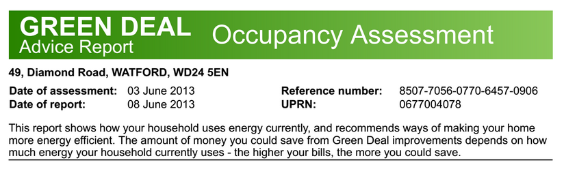
The first thing on the report at the top of page 1 confirms the address of the property, date the assessment was carried out, and the date it was lodged by the assessor. The RRN is a unique identifying number for the report and the UPRN is a unique property identifying number. There is also a short description of the contents of the report.
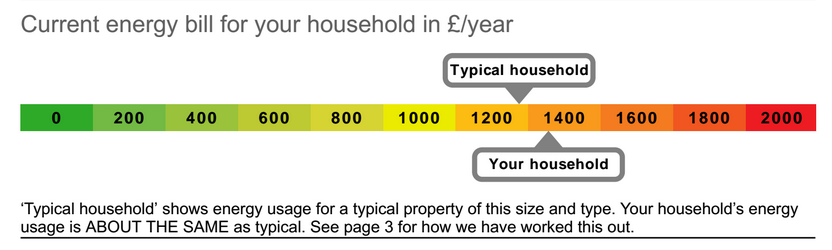
Below this, the next section shows how much money you are spending on your energy bills, when compared to the national average for a similar size and type of property.
If you have provided your bills to the assessor, this should be accurate to the penny. If not, it will estimate based on how much you heat your home and to what temperature, as well as the types of appliances (tumble driers, fridges, freezers etc.) you have.
In this specific report you can see that the actual energy usage in the home is very slightly higher than a typical household of a similar size and construction type.
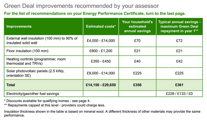
The next section is the bread and butter of the occupancy assessment, detailing all the recommendations made by the assessor based on his or her visit to your home.
It will usually contain many of the recommendations seen on the EPC, but sometimes measures are excluded because they are not applicable or not wanted by the customer. The idea is to create a package of measures tailored to suit you. The three columns on the right show: the estimated cost of installing the measure (this is an automated estimate and very rough), the estimated annual savings made if you install the measure, and the typical annual savings for the average household. These two figures could be very different, and it is the former that is used when calculating your total finance.
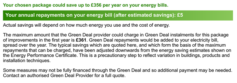
The next part of the occupancy assessment covers the total savings produced by installing all the recommended measures is highlighted and an annual repayment figure is quoted (£5 is effectively how much you will have to pay after the savings from the installations have been taken into account). Here the annual repayment for the first year is estimated at £361. It could be less, but cannot be more than this. The text here also points out that the finance may not cover the cost of the measure – in this case you may need to cover some of the costs up front yourself.
The next part of the Occupancy Assessment looks at how much of your energy bill goes towards space heating, hot water, and lights and appliances. In the right hand column there are some tips on how to save energy, but you should get some more tailored tips in your letter from the assessor (depending on their competence!).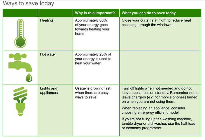
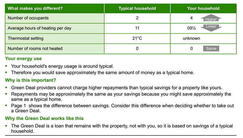
The next section compares some of your occupancy questions asked during the assessment with the average household – so for example the number of hours of heating per day compared with the average or the temperature at which you set your thermostat too.
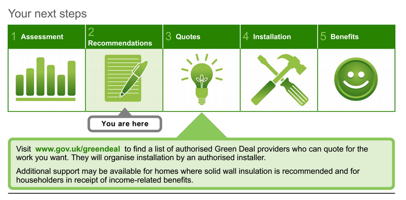
Next the report tries to outline the Green Deal process, and how to find Providers, which is the next step of the process after getting a report. It is always recommended to get quotes from at least 3 Providers, as well as looking outside of the Green Deal if necessary. It is most likely that this is when you will encounter the Green Deal Orb website (to find the providers) – the Orb website is painful to use, so if you need extra help just give us a shout and we will try to point you in the right direction!
We are getting to the end of the Green Deal Report now – but in the next section you can find out more about the company and assessor that carried out the assessment. You will find accreditation details and contact information for the assessor in question if you need to go back to them in the future. 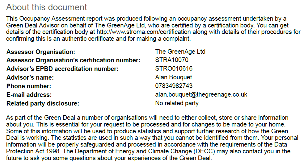
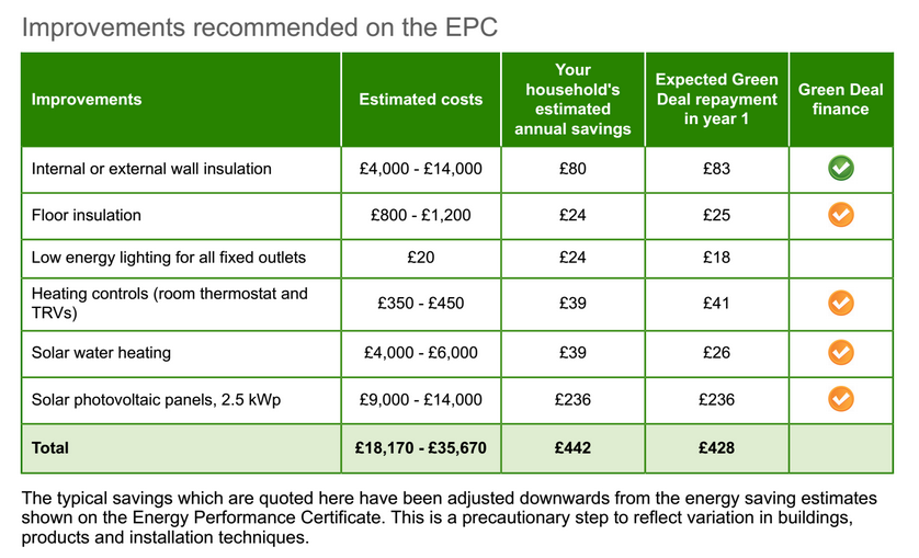
The last page has the recommendations based on the EPC. These are not the measures recommended by the assessor, and are automatically generated by the EPC. This page does however, let you know which measures are partially and which are ‘fully funded’. It was originally was designed so that Green ticks next to measures meant that you can get full finance towards a measure, whereas orange ticks mean you can only get partial finance, with the remaining contribution coming from yourselves, usually up front.
Unfortunately this is not really the case, a green tick will generally mean that the up front cost is much less than with an orange tick, but chances are you will still have to make a contribution up front.
You should refer to page 1 for the measures you have been recommended by the assessor.